Gold Investment: Amartha— UX Case Study
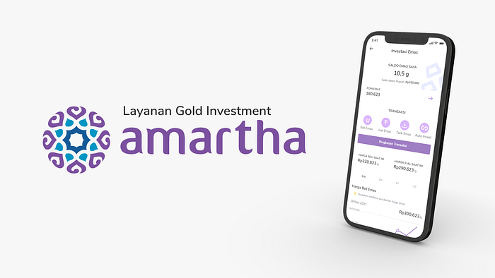
Disclaimer : “This project is part of the UI/UX training program implemented by Skilvul, for Kampus Merdeka program held by Kementerian Pendidikan, Kebudayaan, Riset, dan Teknologi Republik Indonesia. Amartha is the Challenge Partner. I am not working for nor contracted professionally by Amartha.”
Overview
Amartha is a website and application-based platform that supports you to make loans, lend, save and make investments. Established in 2010 as microfinance whose mission is to connect micro business actors with investors online. Amartha’s difficulties in getting access to capital for micro-enterprises can contribute to improving the quality of life of the poor, building economic resilience, and realizing social justice for the people of Indonesia.
Amartha comes with the P2P Loan concept that allows borrowers and lenders to go digital. Amartha wants to change and improve its business line by presenting investment services in the form of Gold Investment. This service is here to answer the various needs of various users. This application cannot be generalized because the expectations of each user and even potential users are different. Here is the user flow relating to the issue mentioned:
- Users who want to make credit can go through the Amartha application. An example is a shop or coffee shop owner who wants to improve their business
- Users who want to lend or make investments through the Amartha application. Later there will be a list that can be seen to give credit.
Background
With this Gold Investment, it is hoped that users can increase their finances. However, investment services may be difficult to accept in some circles of society. For this reason, Amartha wants to create an investment service that is wrapped in gamification to make it much more attractive and fun when investing.
Role In Team
Collaborating with Audilla Putri and Nadia Victoria, as a UI/UX designer I was involved in several parts of the project:
- Express ideas during the Define and Ideate stages of the Design Thinking Framework (including making Low-Fi sketches using the Crazy 8 method).
- Create a Task flow and Wireframe from the Crazy 8 sketches earlier. Here I got the task of designing a wireframe.
- Together with my teammates, I created a UI Style Guide for the app.
- High Fidelity Interfaces (UI Design).
- Conduct Stimulus User Research with the team and become an interviewer for User Testing.
Design Process
In this case, We use the Design Thinking framework to find the best solution based on a Human-Centered approach. Using this methodology, we can accommodate the entire process of understanding user problems and needs, creating solutions from low to high, to final testing — allowing us to understand the product creation journey from multiple perspectives. Involving five phases — Empathize, Define, Ideate, Prototype, and Test — are very useful for dealing with unclear or unknown problems.

1 — Empathize
Empathize stage provides an opportunity for us to represent certain user groups or market segments. At this stage, user representations have been provided by challenge partners, including:
- Gender: Male and Female
- Age: 18–55 years old
- Profession: The person who works in the city with income above IDR 10,000,000
- Geographic: A citizen who is domiciled throughout Indonesia and has middle to upper economic level.
- Behavior / Habits: Have a good level of understanding of technology, Have understanding and experience in investing in gold, and can operate smartphones well.
We also did secondary user research. Secondary research is a type of research that has already been compiled, gathered, organized, and published by others. We conduct competitor analysis, user feedback from the app from similar applications, explore desired products from Challenge Partners, look for related case references on Medium, IEEE, ACM, etc.

2 — Define
The define stage begins with understanding the “pain points” felt by the target user regarding the current use of investment products. From the pain points, we can identify several cases of similar issues. The issues found were then discussed in brainstorming with the team to produce relevant HMW statements.
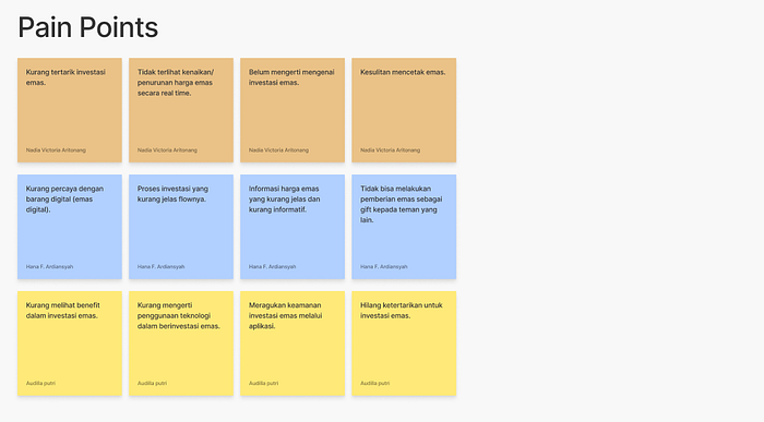
The How Might We formats show that solutions are possible and because they offer you the opportunity to answer them in a variety of ways. How It Is Possible We can provide the perfect framework for innovative thinking.

3 — Ideate
Our team uses several methods to complete ideas in the Ideate stage. Creating affinity diagrams, generating solution ideas, designing wireframes and task flow is a series of activities used to finalize the concept of the feature that will be created.
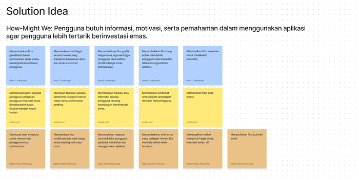
Then, we created an affinity diagram to group the idea solutions into appropriate and related groups.

Then, we created a prioritization matrix. Prioritization Matrix is a standard method to identify which problems are the most important to work on solving first based on effort and user value.

Next, we’ll sketch a rough design (Low-Fi) using the Crazy 8’s method and vote to decide which screen to bring into the wireframe. Here, we sketched out the designs of the Do It Now and Do Next areas.

4. — Prototyping
At this stage, we will transform our thinking from the Define and Ideate stages into a complete high-fidelity design that is user-operable. The first step in this stage is to create a user flow.

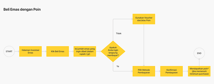


The next step is to create the wireframes, a two-dimensional skeletal outline of an app based on the user flow.

Next, we created a design system. Design System is a component that can be reused for product design & development purposes, both in terms of design and code programming. The Design System contains code rules for component libraries that developers use. The use of a design system can speed up the work process of UI design and developers.
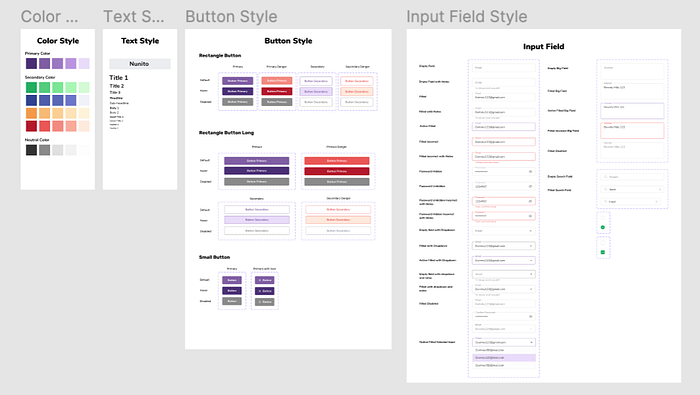
Here we will implement our ideas, sketches, wireframes, and design systems to create a High-Fidelity UI Design. We also create prototypes so users can have basic interactions and the whole idea about our designs.

5 — Testing
The testing stage is carried out using an online deep interview method with a user. We also implemented SUS (System Usability Scale) as UX metrics to find out how easy it is for users to use the Amartha Gold Investment feature prototype that has been developed.
By testing on users, we know the shortcomings of the product before starting to introduce it to the market. This is the last stage of the design thinking process. However, in practice, the five stages in the design thinking process will continue to repeat themselves, since the results of this testing phase can be used to define other problems faced by users.
We did user research on a respondent who matched the criteria for the target user of the application being developed. The methods we use are interviews and usability testing. From this user research, we get a lot of input regarding the usability of the design solutions that we have created.
First of all, we asked the respondent to introduce herself. Then, we gave a prototype design and we asked respondents to try using the application, by asking the questions:

After that, we asked about the System Usability Scale to the respondent:

Result of System Usability Scale:


From this user research, we get a lot of input regarding the usability of the design solutions that we have created. We will use these inputs as material to improve our design.
Iteration
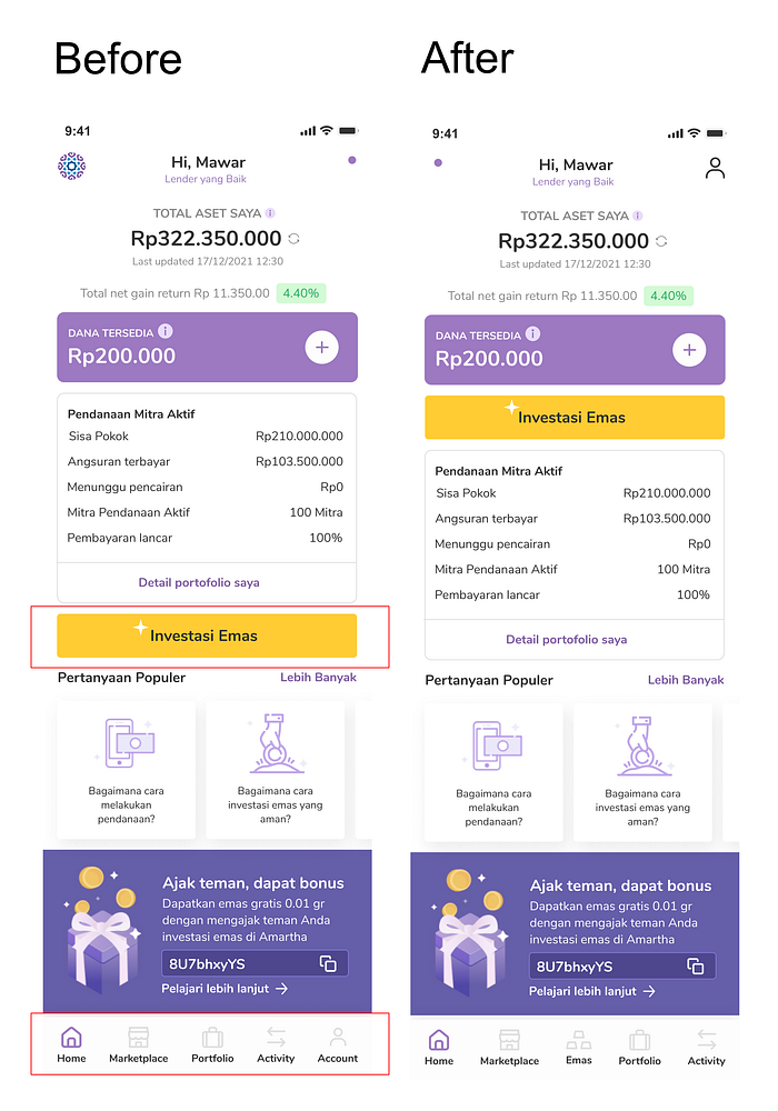
Based on the testing results, we decided to add a button navbar “Investasi Emas” and change the placement since the button is very crucial. If there is no button, users will have difficulty accessing the Investasi Emas page. Other than that, adding buttons doesn’t take much time.
Conclusion
Based on this case study, we learned a lot about applying UX methods and principles, especially in the design thinking process. We started this process by figuring out what users want, defining user requirements, creating flows, designing UI designs, and also doing usability testing. I’m designing a gold investment feature for the first time. With this challenge, I understand how the process of gold transactions is. I need to make every process as detailed as possible so that users can feel the ease of doing gold transactions. I also know that app design has a big impact on users. During the testing, I also saw that some users were happy when using our application. All of these processes were very challenging for us, but we are happy and confused to carry out each process so that we can produce a user-friendly design with an attractive and fun appearance while using the Gold Investment Feature.
Recommendation
Based on the results of user research, users have some suggestions or input related to the features that have been designed. One of them is related to the point feature, on that page, there is information on points that must be highlighted so that users can be aware. This input can improve deficiencies and enhance design strengths.
Thank you for reading! If you have any feedback, don’t hesitate to comment, and don’t forget to clap! 👏
